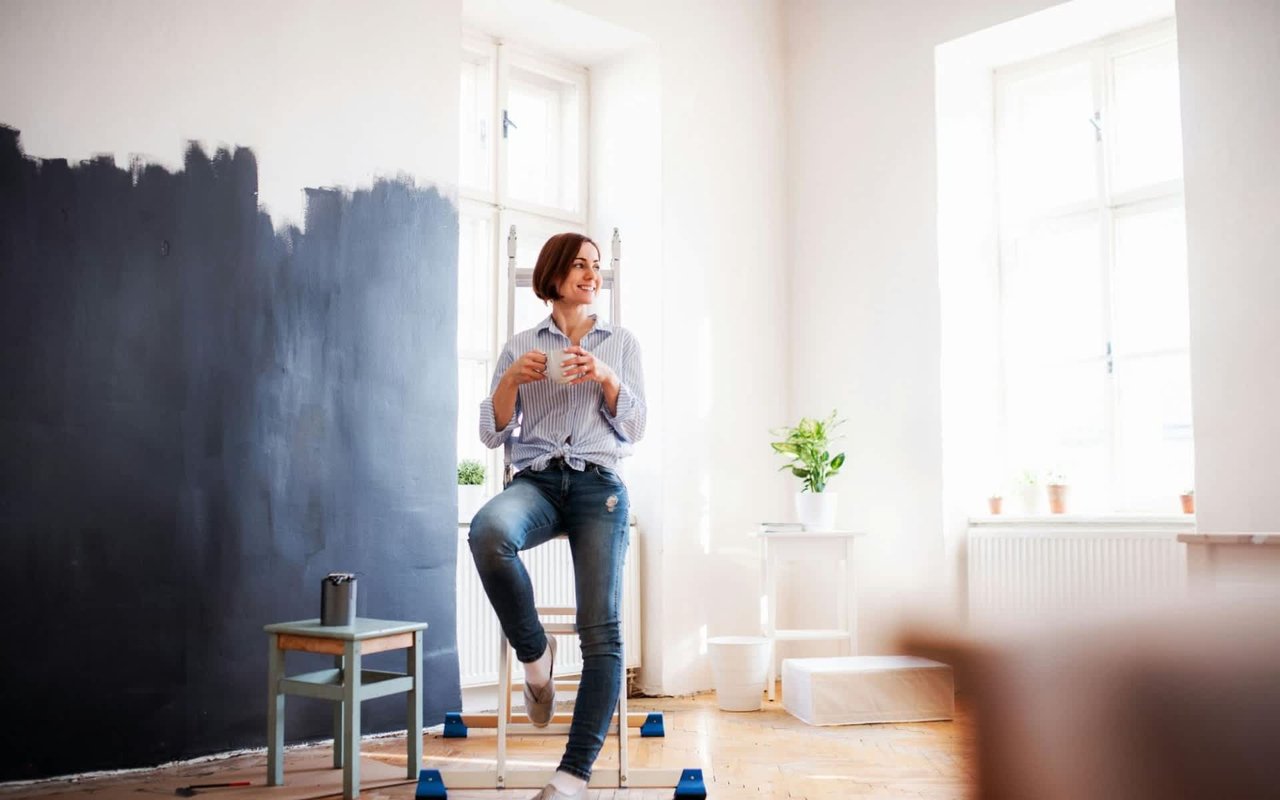
Color plays a pivotal role in interior design, transforming the aesthetic appeal and the psychological atmosphere of a living space. Choosing the right paint tones for each room can enhance mood, influence perception, and even affect the functionality of the area. If you’re ready to level up the paint in your Blue Ridge home, read on to explore the science behind color theory and discover practical advice for selecting the ideal hues for every room in your residence.
The Science Behind Color Selection
Color perception is deeply rooted in psychological principles, influencing emotions and behaviors unconsciously. Scientifically, colors can affect individuals physiologically and psychologically — reds are energizing, often raising heart rates and evoking a sense of urgency, while blues are calming, lowering blood pressure and promoting mental clarity. This connection between color and emotion is crucial in interior design, as it allows us to create spaces that can either energize us or provide tranquility. Understanding the psychological impacts of color can greatly enhance the effectiveness of your design choices, making your Blue Ridge home not only aesthetically pleasing but also emotionally supportive.
Living Room: Warmth and Conversation
The living room is often a central hub for relaxation and social interaction. Warm tones like soft peach, buttery yellows, and muted reds can create a welcoming and cozy atmosphere. These shades encourage conversation and comfort, making them perfect for spaces where people gather. Alternatively, cool tones, such as sage green and soft blues, can impart a sense of calm and openness, which is ideal for smaller living spaces.
Kitchen: Energizing Your Space
The kitchen, often referred to as the heart of the home, benefits from vibrant and energizing colors. Bright yellows and greens reflect light and can make the space feel clean and lively, which is essential in a room where energy is abundant and meals are prepared. For a more modern and sophisticated look, consider deep blues or grays, which can complement stainless steel appliances and modern fixtures.
Dining Room: Setting the Mood
The dining room is a place of gathering and elegance. Rich, deep tones like burgundy, navy, or forest green can add a layer of sophistication and luxury, setting the mood for intimate dinners and lengthy conversations. If you prefer a lighter, airier feel, consider taupe or a muted lavender, which can add a subtle touch of elegance without overwhelming the senses.
Bedroom: A Personal Retreat
In bedrooms, the priority is relaxation and tranquility. Cool colors like soft blues, lavenders, and greens are known to have a calming effect on the mind and can aid in relaxation and sleep. Avoid overly vibrant colors, as these may be too stimulating and disrupt the peaceful ambiance needed in a sleeping environment.
Bathroom: Clean and Tranquil
Bathrooms benefit from lighter, soothing colors that emulate the cleanliness and serenity of spas. Soft tones, such as pale blues, greens, and creams, can create a refreshing and relaxing ambiance. For a touch of sophistication, consider adding accents in charcoal or navy, which can introduce depth and intrigue to the space without diminishing the tranquil vibes.
Home Office: A Productivity Boost
The home office demands a color palette that stimulates the mind and enhances focus. Shades of blue have been shown to boost productivity and reduce stress, making them an excellent choice for office environments. To avoid visual monotony, incorporate contrasting elements of orange or yellow, which can stimulate creativity and energy — especially useful in creative industry workspaces.
Hallways and Smaller Spaces: Expanding the Horizons
In smaller spaces and hallways, light colors can make the area feel larger and more inviting. Shades like cream, pale yellow, and light gray can expand a space visually. If you wish to add a sense of character, consider incorporating a darker accent wall at the end of a hallway to create depth and perspective.
Exterior: First Impressions Count
The exterior of your beautiful Blue Ridge home sets the tone for what's inside. Earthy tones like greens, browns, and blues can harmonize perfectly with alluring outdoor environments. Meanwhile, more saturated colors can make the architecture stand out. Remember, the exterior color should complement the style and era of the building to enhance the curb appeal.
Harmonizing Color with Function
Choosing the right paint colors for your Blue Ridge, GA, home involves understanding the function of each room and the psychological effects of color schemes. By applying the principles of color science, you can create a harmonious living space that is both beautiful and functional. Remember, the best color for any room is one that reflects your personal style and complements the room’s functionality.
If you’re ready to find a beautiful new home in Blue Ridge, GA, team up with real estate expert Laura Elleby today.
If you’re ready to find a beautiful new home in Blue Ridge, GA, team up with real estate expert Laura Elleby today.